IKEA today is one of the best-known brands in the world, and its hallmark is the characteristic blue and yellow logotype. But the logo (or logotype, or insignia, or emblem) hasn’t always looked like this. Because just like IKEA and its business, the logo has constantly been developing. Here we look at the logo’s evolution from 1943 to 2018, when the latest changes were made. So get your magnifying glass out, and join us for the story of the IKEA logo, from letterhead to head of everything!
The evolution and history of the logo essentially follow the varied development of the company and its business. Ingvar Kamprad first registered a company, Handelsfirman IKEA, in July 1943. The business was based on traditional rural peddling, and the role of the emblem was to certify that the company could be trusted. Company name IKEA came from the Ingvar Kampard initials and location tags – Ingvar Kamprad from Elmtaryd, in Agunnaryd.

After cycling around with product samples and selling directly to clients, Ingvar saw a definite upswing with his mail order business, partly thanks to his revolutionary ideas on distribution. This was reflected in the logo. An accent appeared on the É, and the emblem got the addition “Agunnaryd” and the railway address Liatorp. This suggests a certain expansion.
The accent was apparently inspired by the name of French pen manufacturer La Société Evergood, for whom Ingvar Kamprad was now the general agent. This was possibly also why ‘import-export’ was added to the word that now looked increasingly like a graphic logotype, with IKEA written in italics, in lower case and with the accent. The fact that IKEA was written like this is probably one reason why, from the beginning, people said IKEA as a single word rather than four separate letters


IKEA’s journey began in 1948 with furniture sales by mail order. The logo evolved over time, adding “Möbelfirman” (furniture company). Multiple logo variations coexisted, some in uppercase and others in lowercase. Side businesses like publishing emerged, expanding the IKEA brand. The logo “Möbelfirman IKEA, Agunnaryd” marked a milestone, appearing on printed materials as their volume rapidly grew.


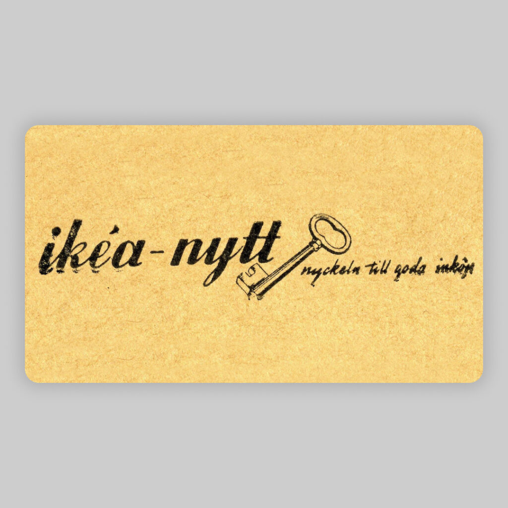
Between 1948 and 1952, ikéa-nytt was published, an ordering catalogue and the predecessor to what would later become the annual IKEA catalogue. The logo remained unchanged during these four years, in italics and lower case.


All the logos of that time were hand-drawn, including the initial sketches by Sandströms design and print agency in 1951. The logo featured a cloud, the company name, and additional words like “Möbler” and “Bosättning.” Ingvar Kamprad acquired a joinery in Älmhult a year later.
The word-group ‘Kvalitetsgaranti’ (quality guarantee) together with IKEA first appeared in 1951, in connection with the first home furnishing catalogue. The seal of quality was short-lived, disappearing a year later, never to be seen again. But the guarantee promise itself came to be a central aspect of IKEA and its brand-building.
In 1952, legendary head of advertising Gillis Lundgren redesigned the Sandström version, producing the embryo of the logo we know today. By this time the company was selling furniture in hardwood, a quality hallmark that was transferred to the colour of the logo. The word-group was now positioned diagonally and written in upper case only.
Occasionally, Möbel-IKEA formed a new word-group, often with an added ÄLMHULT, where the newly acquired joinery had been converted into a showroom – and this in itself was a modern development. The capitals were now here to stay. When the first store was built in 1958 in Älmhult (today the home of the IKEA Museum), one new development was a stylised picture of the building alongside different versions of the logo.


Gillis Nilsson, a professional production designer, simplified and standardized the logo. In 1962, the accent above the E was removed, and the font was redesigned for better recognition. The diagonal shape became horizontal, and IKEA was placed inside an oval with variations of ‘Möbel’ and ‘Älmhult’. The logo became black and white, framed by a rectangle.
As IKEA expanded, the Kungens Kurva store in 1965 featured the logo with the words MÖBEL, IKEA, and ÄLMHULT beneath it, similar to the current logo. The original logo was created using ink and brush, with the letters in IKEA drawn using an in-house typeface based on an extra-bold Futura.


IKEA’s expansion extended to the European Continent in the 1970s, with the opening of the first store in Switzerland. The logo evolved to feature only the international name IKEA, as seen in the 1977 catalogue. Graphic variations emerged during the era of rapid expansion, such as the Swedish elk in Germany and a stylised Viking in Japan and Canada. Denmark opted for a playful teddy bear alongside the logo, distancing itself from Sweden.


Due to the widespread graphical degradation, a necessary change process was eventually introduced in the 1980s. By now, the black and white IKEA logo had also been both red and white, and blue and yellow, with the addition of various characters. 1984 saw the first real visual profile manual, which clearly outlined the use of IKEA as a ‘trademark’ and IKEA as a ‘wordmark’. Also around this time, the trademark was registered (®), giving it official copyright protection for the first time.


IKEA’s global expansion turned it into a Swedish export, with its catalogue becoming one of the world’s most widely distributed printed works. The blue and yellow stores, featuring the iconic IKEA wordmark, became a symbol of the brand’s presence. Despite variations in logo colors, the brand’s strength remained consistent across regions.
Before the most recent update in 2018, the logo had not been revamped since the 1980s. The latest changes were intended to improve legibility, and ensure consistent recognition and colour reproduction in the new digital age. Nowadays, the same logo has to work just as well on a mobile screen as on a store front or paper bag.


As a teenager, Ingvar Kamprad ran his company from home in Elmtaryd. In a small shed he kept packages that were to be picked up by the milk-collecting lorry in the morning.
This can be marked as one of the first parcel machine system for picking up ordered items.
Many major brands make extensive changes to their logo over time. Sometimes they switch to something completely different and make quite a fuss of it. But IKEA has had essentially the same fundamental expression in its logo since the 1960s. This is nicely in line with the general attitude at IKEA – to hurry slowly, be cost-conscious and preserve the origins. Because if you have a strong, distinctive promise, there’s no need to make constant changes. Few people have expressed it better than the IKEA founder, Ingvar Kamprad himself. When asked, “So what does IKEA actually stand for?” in a 2014 interview, his immediate reply was, “IKEA stands for good stuff at decent prices.” And who would want to change that?